
Digital first impressions happen quickly. An article on Ragan covered the Missouri University of Science and Technology's research on the topic, and the results might surprise you: the study found that people form first impressions of a website within 2.6 seconds.
Knowing that the look and feel of a website can be what stands between someone reading your content—and potentially hiring you for a gig—or not, we looked at some great writer websites and broke down three essential components: professional appearance, simple layout, and well-organized samples.
Professional Appearance:
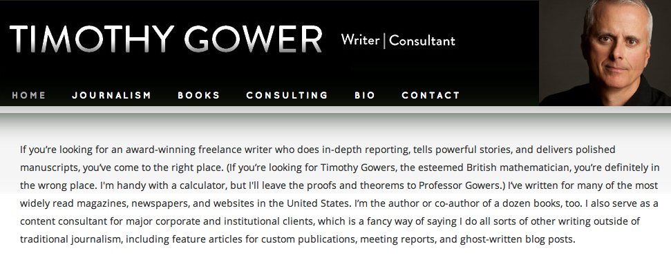
With less than 3 seconds to leave visitors with a positive impression, the overall look of your site should be very professional—avoid pictures of cats, overly "playful" fonts, and anything that could be construed as amateur. Timothy Gower and Cynthia Starks accomplish this well: their sites are simple, uncluttered, and use classic color schemes and fonts. The results are great-looking, professional websites that allows each writer and his or her content to stand out.

Simple Layout:
Attention spans are shrinking by the minute, and people often don't have the patience to hunt for information, so it's very important to make clear who you are and what you do. Theresa Sullivan Barger and Alan Goldsher do a nice job of this: you have a clear sense of their skills and focus immediately, without having to scroll or click a link. Each also includes a professional photo, a brief bio, and clear tabs leading you to things like testimonials, projects, and contact information.


Although it may be tempting to include graphics, music, and other flourishes, resist the urge, as these are a distraction to your audience. Keep things simple and clear, and allow your work to speak for itself.
Well-Organized Samples:
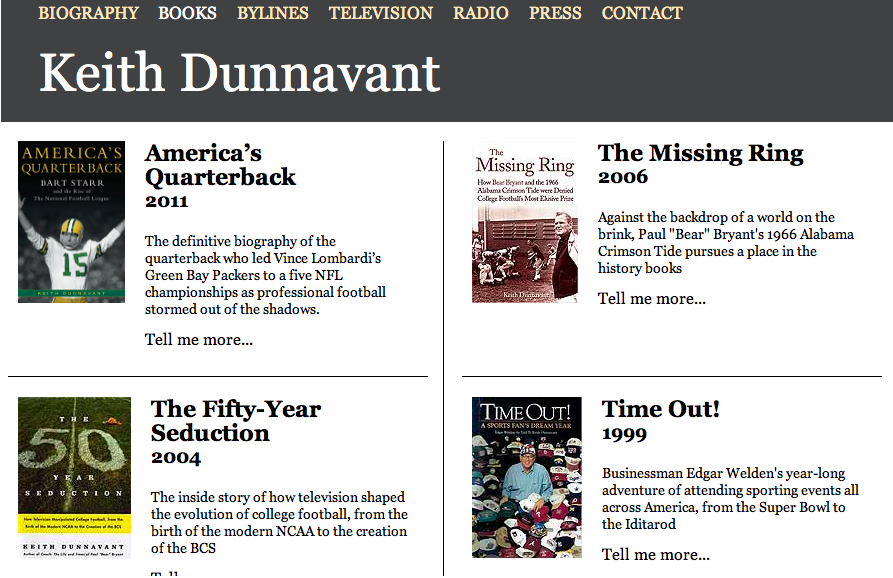
On freelance writer websites, samples are generally the main thing people want to see, so these should be easy to find and organized well. Whether you group your samples by topic or by project type, the best websites make it effortless to find and peruse your writing. Keith Dunnavant organizes his books chronologically and uses their cover images, which makes his credits both easy to follow and visually appealing.
Janice Harper also takes a simple approach, listing her samples by type and date.

Len Hollie, on the other hand, provides links to all of his samples and organizes them by topic, which lets viewers easily narrow their search.

Each writer has taken a unique approach suited their experience, but each site is well organized and easy to navigate.
These tips should not be one-size-fits-all solutions. Your website should reflect your personal style as well as who you are as a writer, which will be different for everyone. But by having a simple, professional, and well-organized website, you and your content will leave a great lasting impression.


No comments:
Post a Comment